
Tips and Tricks For Data Visualization
Compare different data visualization tools and pros/cons to each.
~Introduction~
Data visualization has taken the world by storm in recent years. Everyone wants their data to be presented in an engaging, easy-to-understand way. It allows us to analyze complex data, identify patterns, and extract valuable insights. It enables decision-makers to look at the simplified data and quickly make informed and accurate decisions. The boom in data visualization tools has made it easier for coders and non-coders alike to present data in a visually appealing way.
This tutorial will focus on three of those tools and compare setup, syntax, and results so you can decide which tools you would like to use. The three I will be focusing on are Python packages matplotlib and seaborn and R library ggplot2. For this tutorial, I will be using the World Instant Noodles Consumption 2022 dataset. Following the coding tutorial, I will provide a comprehensive list of comparisons to showcase some of the similarities and differences between the tools.
~Python~
Python has several packages developed to make data visualization easier. Two of the most popular are matplotlib and seaborn. matplotlib is the base-level package for data visualization in Python. It is highly customizable, can have a steep learning curve, and primarily makes static plots but can also do interactive plots.
seaborn is built on top of matplotlib and makes more aesthetically pleasing plots. It specializes in statistical plotting and works seamlessly with Pandas dataframes. It also simplifies the process of making visualizations and quickly generates informative statistical plots.
Using the dataset above, we can use these packages to create appealing data visualizations.
Step 1: Import Libraries and Load the Data
Before loading the data, make sure you have the proper packages installed by running this code into your terminal.
pip install matplotlib seaborn pandas
Once your packages are installed, you can load the data in Python.
import pandas as pd # loading pandas
import matplotlib.pyplot as plt # load plotting packages
import seaborn as sns # loading seaborn packages for plotting

data = pd.read_csv("noodles.csv")
Step 2: Prepare the Data
Preparing your data is important before making visualizations. This step can include cleaning data, sorting it, removing duplicates, and making data types consistent. In this example, we will select the top 10 countries after sorting the data in descending order.
top_10_countries = data.sort_values(by='2022', ascending=False).head(10)
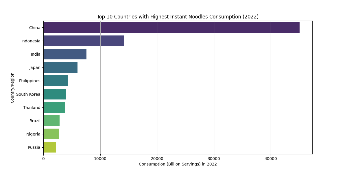
Step 3: Create a Bar Plot and Box Plot
Before making the plots, note that Python has various colors and palettes to choose from for further customization. Additionally, you can save your plot as a value, but it might require some minor code changes. To make the bar plot, follow the code below:
plt.figure(figsize=(12, 6))
sns.barplot(x='2022', y='Country/Region', data=top_10_countries, palette='viridis')
plt.title('Top 10 Countries with Highest Instant Noodles Consumption (2022)')
plt.xlabel('Consumption in 2022')
plt.ylabel('Country/Region')
plt.grid(axis='x')
plt.show()
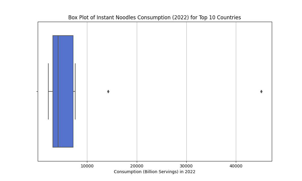
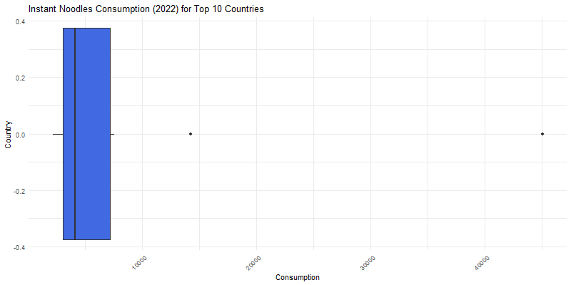
To make the box plot, follow the code below:
plt.figure(figsize=(10, 6))
sns.boxplot(x='2022', data=top_10_countries, color='royalblue')
plt.title('Box Plot of Instant Noodles Consumption (2022) for Top 10 Countries')
plt.xlabel('Consumption in 2022')
plt.grid(axis='x')
plt.show()
To save your plots as a .png or other file type, you can use the following code:
plt.savefig('top_10_countries_bar.png', format='png')
plt.savefig('top_10_countries_box.png', format='png')
~R~
R is a great tool for data scientists. It is built to interpret data graphically, making it easy to create visualizations with the programming language. R has a base graphical library loaded to make visualizations simply, but this tutorial will focus on one of the optional libraries, ggplot2. ggplot2 is a coherent system for building and describing graphs. The syntax can be longer than the base R graphics, but it gives more room for creativity and aesthetics. To show the similarities and differences in making visualizations in Python vs. R, the below steps will show how to make the same kind of graphs as above in Python.
Step 1: Load Libraries and Data
Just as in Python, we need to start by loading the libraries we need to make our graphs, and loading the data. The dplyr library makes syntax more straightforward to use, and ggplot2 will help us make our graphs.
library(ggplot2) # graphics package
library(dplyr) # consistent and clear syntax

data <- read.csv("noodles.csv")
Step 2: Filter the Data
Once the data is loaded, we need to filter our data. To do this, we will use the %>% or ‘pipe’ symbol so we don’t have to run different lines of code and they can run together.
top_10 <- data %>%
  arrange(desc(`2022`)) %>% # arrange data in descending order by the 2022 variable
  head(10)
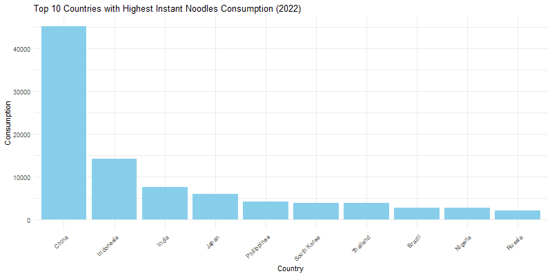
Step 3: Create the Bar and Box Plots
In R, it is best practice to save plots and graphs as values to reference later. The same can be done in Python. R has a variety of colors and themes to choose from to further customize your visualizations. Below is the code to make the bar and box plots. Note: when loading data into R, sometimes symbols in variable names will change. Make sure to look at your data before listing variables to best avoid errors.
Create the Bar Plot:
bar_plot <- ggplot(top_10, aes(x = reorder(`Country/Region`, -`2022`), y = `2022`)) +
  geom_bar(stat = "identity", fill = "skyblue") +
  labs(title = "Top 10 Countries with Highest Instant Noodles Consumption (2022)",
       x = "Country",
       y = "Consumption") +
  theme_minimal() +
  theme(axis.text.x = element_text(angle = 45, hjust = 1))
print(bar_plot)
Create the box plot:
box_plot <- ggplot(top_10, aes(y = `X2022`)) +
  geom_boxplot(fill = "royalblue") +
  labs(title = "Instant Noodles Consumption (2022) for Top 10 Countries",
       x = "Country",
       y = "Consumption") +
  theme_minimal() +
  theme(axis.text.x = element_text(angle = 45, hjust = 1)) + coord_flip()
print(box_plot)
When saving plots from R as a file, you can customize the size and file type. To save your plots, use the following syntax:
png("top_10_countries_bar.png", width = 800, height = 400)
print(bar_plot)

png("top_10_countries_box.png", width = 800, height = 400)
print(box_plot)
dev.off()
~Compare and Contrast~
Let’s delve into what makes the Python and R tools we used in the tutorial similar and different.
Differences
- Approach and Syntax
seabornandmatplotlibwork together sinceseabornis built onmatplotlib.seabornis a high-level interface for creating aesthetically pleasing graphics.matplotlibis a low-level library that offers detailed control over plots and is versatile.ggplot2has a “grammar of graphics” approach is built aroung consistent logical approaches for plot creation, and can create complex plots with less code.
- Default Aesthetics
seabornhas good default aesthetics and is suitable to make quick, attractive visualizations (especially statistical visualizations).matplotlibhas good control but weaker default aesthetics compared toseaborn, requiring more customization for aesthetic plots.ggplot2is flexible with aesthetics and requires less tweaking to make attractive plots thanmatplotlibbut potentially more code thanseaborn.
- Ecosystem
- In Python,
matplotlibandseabornare part of a broad ecosystem of data science and visualization libraries. - In R,
ggplot2is part of the R ecosystem and provides seamless integration with other R libraries.
- In Python,
Similarities
- Customization
- Both the Python and R packages and libraries have high degrees of customization.
- You can adjust colors, labels, legends, sizing, and more
- Community Documentation
- Both tools have active communities with extensive documentation
- You can easily find help and examples of using the tools.
~Conclusion~
The tools discussed in this tutorial barely scratches the surface to all the data visualization tools available. Python and R are some of the most common tools used in the data science world, but there is still more to discover. Explore different tools such as Tableau, Power BI, plotly in Python, D3.js, Excel, and QlikView/Qlik Sense. Explore other tools and experiment with the unique features they offer. Continue to practice your Python and R data visualizing skills. The data science world is adapting quickly, so keep learning and innovating!